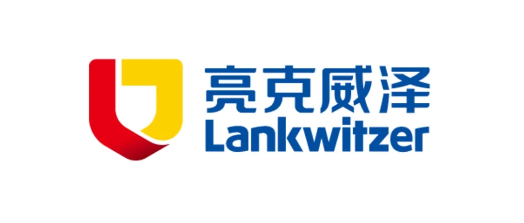

The new logo of Lankwitzer is officially launched today, continuing the classic color scheme of red, yellow, and blue. The new shape design highlights the new brand image of Lankwitzer as an expert in industrial paint.

———————————————— logo释义 ————————————————

Brand letters
The logo is artistically designed by the initials L of English letters“LANKWITZER” and “LACKE”. The first L is the initial letter of the brand “LANKWITZER”, also the initial consonant of the counterpart Chinese translation, while “LACKE” means “paint” in German, communicating the uniqueness and industry representation of the company.
Safety Protection
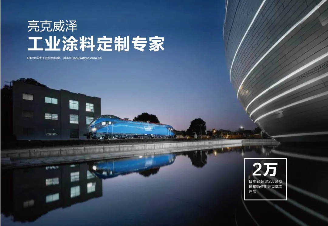
In view of shape, “shield” serves as the creative starting point. The products of Lankwitzer are widely used in high-speed railways, EMU and other rail vehicles, and automobile parts, like a protective shield for vehicles, conveying the safety performance and durability of Lankwitzer industrial paint products.
German quality
The matching of red, yellow, and blue, where red represents enthusiasm and exuberance, yellow warmth and brilliance, and blue a remainder of the sky and the ocean, representing tranquility and sanity, which not only reflects the color diversity of Lankwitzer paint but also represents the company’s diversification and enterprising spirit.
The red and yellow colors come from the German flag, conveying to customers the brand promise that Lankwitzer originates from Germany and will always adhere to the strict and meticulous German quality.

Craftsmanship spirit
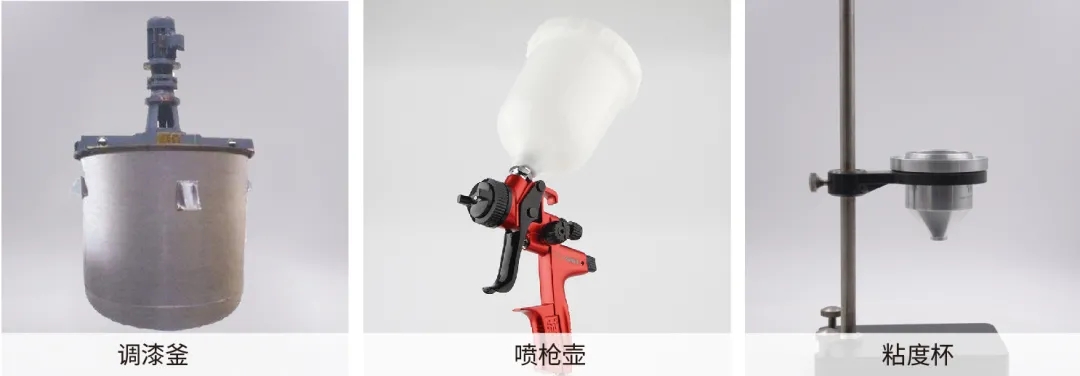
The overall shape, besides the shield shape, is also similar to the most frequently used paint mixing kettle and spraying pot, and the internal shape highly resembles the viscosity cup, covering the whole process of paint from R&D, production, manufacturing to use. The industry characteristics are self-evident, fully highlighting the dedicated and professional craftsmanship spirit of Lankwitzer.
Open spirit
The partial shape design has openings at the top and bottom and in the middle part, with both inlet and outlet, representing the company’s spirit of tolerance and openness.
Trust and cooperation
The red and yellow shape also resembles the handshake shape for cooperation, transmitting the sincere and trustworthy brand image of the company to customers.
Lankwitzer has fully launched the brand VI upgrade project. With this new starting point, Lankwitzer will embrace the future with a brand new attitude. With advanced paint production technology, strict quality control standards, perfect technical service support, and advanced eco-friendly product placement, Lankwitzer is always satisfying the market demands.
